I am a people-centered designer with the ability to identify problems and strategize solutions. 

I know how to make it look good, too.


research

From Stakeholder Interviews to Data Mapping, I can research with the best of them. I have spent months, working with a team, researching one or more topics in order to fully understand the challenges of our users to help them succeed. I’m also very familiar with planning, facilitating, and analyzing user research.

quickProject_sketchboard.png

strategy

Whiteboarding is a girl's best friend! I frequently draw out what I’m thinking and am experienced in facilitating, and participating in, group brainstorming sessions with the goal of both ideating and narrowing down possible solutions.

UWP_4k_homepageUpdate.png

design

Once a problem and possible solutions have been discovered. I am prepared to create, share, and test various prototypes to determine which solution is most appropriate for the user. I’m also very familiar with planning, facilitating, and analyzing usability testing.

How can we better understand our users and their needs?


Early on, it became clear that there wasn’t enough data available to drive meaningful product and design decisions, which meant usability wasn’t a priority. Over time, I (with help from the Product team) collected enough data to educate and persuade leadership on the importance of improving usability.

The result was a year long exploration (see The Plan below) into how customers were using the product, what their problems really were, and how we could plan a long-term strategy for achieving their user goals. I supplemented that with regular usability tests with people who had never used the product before to discover their expectations and validate our designs—building trust within the organization.


Planning for an observation session in San Jose, CA

After a series of usability tests and observation sessions, patterns started to emerge in the data that led us to realize that while we had been focused on collaboration, our users were focused on giving impressive, flawless presentations.

So, with high value presentations (on touch displays in EBCs or executive boardrooms) at the forefront of our use cases, and our users more clearly defined around that use case, we set out to identify the overall needs and goals of users in the room vs. those at the desktop (i.e. presenters vs. preparers).

Users - what do they need?


The Plan

I started piecing together all the product improvement ideas and user data I had been gathering during my time at Prysm, and set out exploring a variety of projects that could work together to get us to our end goal—a series of new features that would support a presentation “mode”. As you’ll see below, that started with some baseline usability improvements.

An interactive activity with leadership to align everyone on the proposed long-term strategy.

How can we help users incorporate Prysm into their daily workflow?


The way users interact (select and deselect) with objects on the workspace is the most fundamental piece of usability, and at Prysm it was causing confusion and required too much cognitive load—preventing users from adopting Prysm into their daily routine. I determined that it was time to diverge and optimize the paradigms for each form factor—room vs. desktop.


The Room

The room is a group experience, so allowing users to interact simultaneously is important. That, plus a lack of established, large format (65” or larger), touch paradigms gave us a unique challenge.

How do we translate desktop and tablet/smartphone paradigms to a touch display over 65”?

I designed two potential solutions to the selection problem in the room. After testing both solutions with brand new users, and preparing to test them with existing users, I ended up with a hybrid of the two original solutions—a menu redesign and a series of new gestures to make interacting with objects on the workspace better.


The Desktop

The desktop is primarily an individual experience, so the group selection paradigm only caused confusion. Users expected to select one thing at a time, and to use keyboard controls and shortcuts, which did not exist in Prysm. The goal here was to make the desktop more familiar to users—single select, keyboard controls, group actions, universal toolbar, etc.

Based on validation of the menu system in the room I designed a similar, universal toolbar for the desktop experience. It is centered at the top of the screen for familiarity, consistency, and easy access on a laptop or tablet. It is dynamic, and changes based on the object selected (ex. sticky notes have background color options a PDF doesn’t have).


How can we help users get where they’re going faster and more easily?


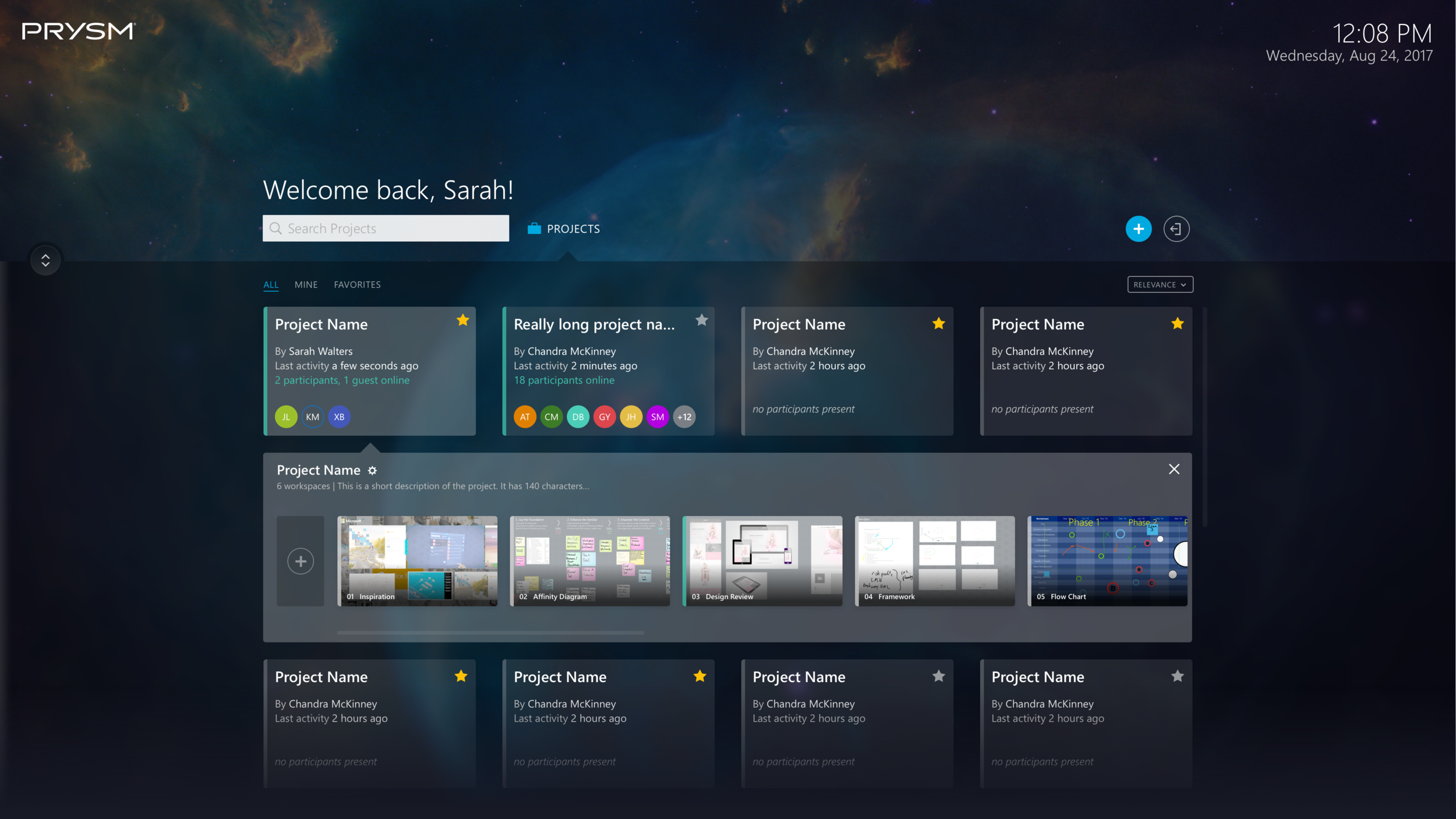
Projects and their workspaces are the heart and soul of Prysm. The homepage, therefore, is pivotal in getting them where they need to be as quickly and easily as possible. To do that, I made project cards that opened up to show thumbnails of the workspaces so users could identify the right project with minimal effort. I also added a search bar, sort dropdown, and a few filters to make browsing easier. I also suggested adding activity indicators so users could quickly find where their colleagues are and join them. 


Prysm for Rooms Homepage

Projects
I designed this for the first Prysm for Rooms product, which required a darker interface to look best on the original LPD technology.

Workspaces
The original homepage didn’t allow for viewing workspaces, but it provides additional context that is crucial to finding the right project.

Prysm for Web Homepage

Projects
I updated the homepage for the Prysm for Web product, adding a hi-res background image and a frosted glass overlay to match the feel of the room refresh.

Workspaces
This design was also used for the new Prysm for Desktop app and the new Prysm for Rooms app homepages (which allowed for a light interface, unlike the first product).


How can we help local musicians connect?


After researching the struggles for local musicians in Indianapolis, our research team discovered that they needed a central organization focused on bringing everyone together and providing necessary resources to help them succeed.


How can I help young adults with Autism?


This app is designed to help young adults with Asperger Syndrome learn to organize their lives on their own, so they can become less reliant on their parents.


How can I help local musicians connect quickly?


After spending some time researching the local music scene, I discovered that local musicians have a hard time connecting. BandMate is an app that makes it easier for them to search for, and find, other musicians to work with.